An explanation of quartiles, quintiles deciles, and boxplots.
Previously
“Again with variability of long-short decile tests” and its predecessor discusses using deciles but doesn’t say what they are.
The *iles
These are concepts that have to do with approximately equally sized groups created from sorted data. There are 4 groups with quartiles, 5 with quintiles and 10 with deciles.
But it isn’t quite as easy as perhaps it should be. These words are used for two different concepts:
- the data in a group
- the dividing line between groups
So the top decile can be either the 10% of the data that are biggest, or a point that divides that group of biggest values from the next smaller group.
There is one fewer dividing line than groups.
Boxplot
The premier graph that uses quartiles is the boxplot.
Figure 1 is an example boxplot — it shows the daily log returns during 2012 (so far) for a particular stock (MMM).
Figure 1: Boxplot of daily log returns of MMM in 2012 year-to-date. 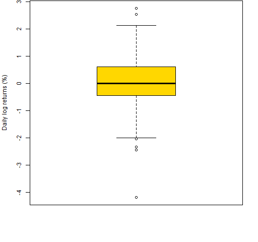 Figure 2 is an explanation of the elements of Figure 1.
Figure 2: Annotated boxplot. 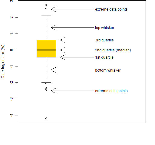
The middle half of the data is in the box. The line inside the box is the median.
The interquartile range (IQR) is the 3rd quartile minus the 1st quartile. This is one of the statistics given in the market portraits.
The whiskers end at a data point, but can be no longer than some length. In R the default is that whiskers can be no longer than 1.5 times the IQR.
Points beyond the whiskers are sometimes referred to as “outliers”. That is not particularly good nomenclature. For there to be an outlier, there really needs to be a model.
Boxplots are useful for a single variable, but they really shine when you have multiple variables to compare. Figure 3 is a boxplot of daily returns of a few stocks.
Figure 3: Boxplot of daily log returns of a few stocks in 2012 year-to-date. 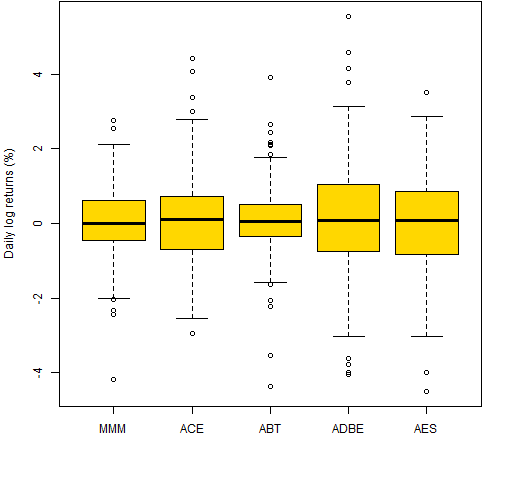
Epilogue
Some are watching it from the wings
Some are standing in the center
–from “People’s Parties” by Joni Mitchell
Appendix R
R is a good environment for whatever *ile you are interested in.
multiple boxplots
There are three likely ways of getting multiple boxplots.
The first is to give the boxplot function a list. In particular, a data frame is a list. So we can do:
boxplot(data.frame(retMat[,1:5])) # Figure 4
This extracts the first 5 columns of the return matrix and then changes it into a data frame.
Figure 4: Boxplot from a list (data frame). 
The second way is via a formula. An R formula involves the ~ operator. boxplot expects the formula to be of the form:
values ~ groups
where values and groups are vectors of the same length.
It is often the case that you’ll give a data frame as the data argument, and the columns of that data frame hold the variables that appear in the formula. However, that is not mandatory:
boxplot(retMat[,1] ~ substr(rownames(retMat), 6,7))
# Figure 5
Here we use the first column of the return matrix as the values part of the formula, and extract the month of the year (2012) from the row names to use as the groups. Hence we have a separate boxplot for each month of 2012. The result is Figure 5.
Figure 5: Daily returns of MMM by month of 2012 (base). 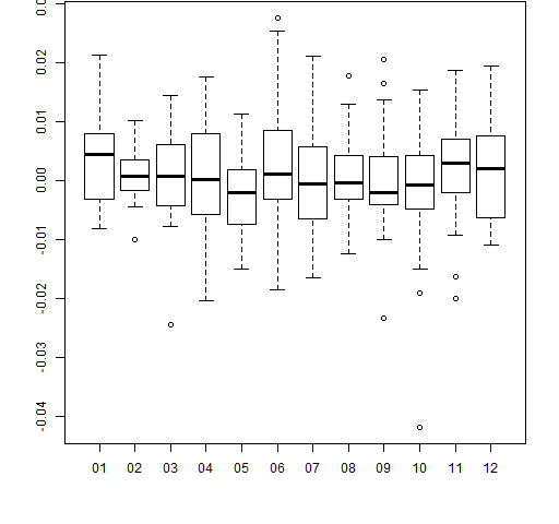
All of the graphics above use the base graphics in R. An alternative is the ggplot2 package. We can do the same thing as in Figure 5 with the ggplot2 command:
qplot(substr(rownames(retMat), 6,7), retMat[,1],
    geom='boxplot') # Figure 6
Figure 6: Daily returns of MMM by month of 2012 (ggplot2). 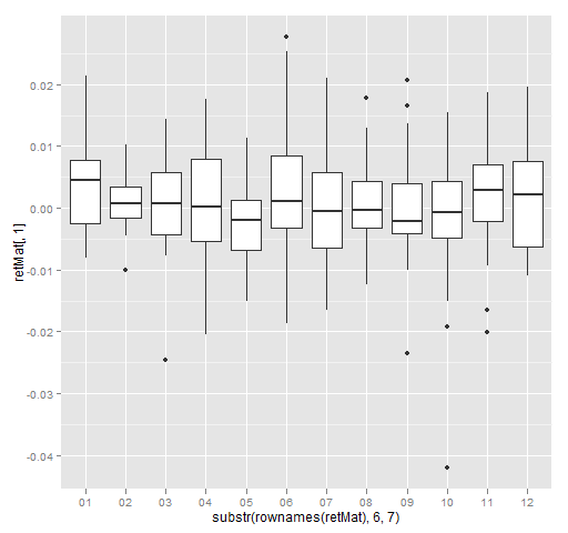
annotated boxplot
The function that created Figure 2 was:
function (filename = "boxexplan.png")
{
        if(length(filename)) {
                png(file=filename, width=512)
                par(mar=c(5,4, 0, 2) + .1)
        }
        bp <- boxplot(retMat[,1] * 100,
                ylab="Daily log returns (%)",
                col="gold", xlim=c(.5, 3))
        bps <- bp$stats
        loc <- c(mean(bps[1:2]), bps[2:4],
             mean(bps[4:5]), -2.5, 2.5)
        arrows(2, loc, c(1.1, 1.3, 1.3, 1.3,
             1.1, 1.1, 1.1), loc)
        text(2.03, loc, adj=0, c("bottom whisker",
                "1st quartile",
                "2nd quartile (median)",
                "3rd quartile", "top whisker",
                "extreme data points",
                "extreme data points"))

        if(length(filename)) {
                dev.off()
        }
}
computing dividing lines
The quantile function will provide values that divide the groups. For example deciles can be computed as:
quantile(x, probs=seq(.1, .9, by=.1))
or possibly:
quantile(x, probs=seq(0, 1, by=.1))
finding groups
We’ll go from simplistic to less simple.
1. do-it-yourself
The do-it-yourself approach is:
cut(x, quantile(x,(0:10)/10), labels=FALSE,
     include.lowest=TRUE)
2. cut2
You can use the cut2 function in the Hmisc package. If you want deciles, then you would do something along the lines of:
cut2(x, m=length(x)/10)
3. quantcut
The quantcut function in gtools takes care of a problem that can arise in the solutions above. If there are a lot of repeated values, then the dividing points may not be unique. quantcut checks for that and if it occurs, then it reduces the number of groups returned.
4. fixer-upper
You may really want the same number of groups that you requested. Hence you could end up with observations that have the same value but are in different groups.
In general, the number of data points is not divisible by the number of groups. A nicety is to make groups in the center have an additional observation, rather than the first (smallest) groups.
Here is a function to do that:
ntile <-
function (x, ngroups, na.rm=FALSE)
{
        # function to get ntile
        # (quartile, quintile, decile, etc.)
        # groups from a vector

        # placed in the public domain 2012
        # by Burns Statistics

        # testing status:
        # seems to work

        stopifnot(is.numeric(ngroups),
                length(ngroups) == 1,
                ngroups > 0)
        if(na.rm) {
                x <- x[!is.na(x)]
        } else if(nas <- sum(is.na(x))) {
                stop(nas, " missing values present")
        }
        nx <- length(x)
        if(nx < ngroups) {
                stop("more groups (", ngroups,
                        ") than observations (",
                        nx, ")")
        }
        basenum <- nx %/% ngroups
        extra <- nx %% ngroups
        repnum <- rep(basenum, ngroups)
        if(extra) {
                eloc <- seq(floor((ngroups - extra)/2
                    + 1), length=extra)
                repnum[eloc] <- repnum[eloc] + 1
        }
        split(sort(x), rep(1:ngroups, repnum))
}
This can be used like:
ntile(rnorm(63), 10) # deciles
ntile(rnorm(63), 5)  # quintiles
ntile(rnorm(63), 4)  # quartiles
Anyone see any problems with this function?
Great post. The one addition I propose (having spent some time experimenting with boxplots this year) is to do a boxplot on some generated data compliant with a normal distribution with an equivalent mean and sd, such as
x <- rnorm(1000, mean=mean(v.mmm, sd=sd(v.mmm))
where mmm is the vector of your data – e.g. the 3M log returns…
to show that one should expect "extreme values" even from normally-distributed data. The question I am currently pondering is the best way to decide if the number of extreme values is significantly greater than one would expect from an identical sample from model distribution – i.e. what is the probability that this distribution is fat-tailed. Have been considering an approach using the bootstrap. Any thoughts?
Thanks again for the thoughtful post,
John
oops – should have set n for the model distribution to length(mmm), not 1000. Hit “send” too fast…
Doing your simulation a number of times should provide a sense of what the boxplots would look like under the normal.
But I think you would want to do something more specific to test the tails. I can’t think of any technique in particular at the moment.
Spoiler: daily returns have longer tails than the normal.
Pingback: Simple tests of predicted returns | Portfolio Probe | Generate random portfolios. Fund management software by Burns Statistics
Pingback: Portfolio tests of predicted returns | Portfolio Probe | Generate random portfolios. Fund management software by Burns Statistics
Pingback: Another Chart – Box Plot of Non-Farm Payrolls | Trend Spotting in the 'Nati
Pingback: Historical Value at Risk versus historical Expected Shortfall | Portfolio Probe | Generate random portfolios. Fund management software by Burns Statistics
Pingback: A first step towards R from spreadsheets - Burns Statistics
John Tukey deserves enoromus credit for his energetic and enthusiastic advocacy of box plots (and, naturally, much, much else in statistical graphics, statistical science, and science, generally).But the claim that he invented the box plot, although passed on from course to course and text to text as an invariable meme, is at best a half-truth. Re-invention, very likely. Box plots were used in climatology and geography from at least 1933, usually under the dull name dispersion diagram . later Mary Ellen Spear included them in 1952 as range bars in a text on graphics, as this paper acknowledges. Such diagrams showed median, quartiles and extremes, and often _more_ detail about other data points than many box plots do at present. (That box plots often leave out too much is a frequent discovery.) The name box plot is, so far as I can gather, 100% Tukey, as are his rules on when to show individual data points beyond the whiskers .
Pingback: Probably the most useful R function I've ever written - Burns Statistics
Pingback: Probably the most useful R function I’ve ever written | WebProfIT Consulting
Pingback: Probably the most useful R function I’ve ever written – Mubashir Qasim