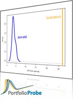
Performance analysis of an example portfolio.
The portfolio
We explore a particular portfolio during 2007. It invests in S&P 500 stocks and starts the year with a value of $10 million. Initially there are 50 names in the portfolio. It also ends the year with 50 names but has up to 53 names during the year.
The constraints on the portfolio are:
- long-only
- 50 to 60 names
- no asset may have more than 4% weight when the portfolio is changed
The portfolio was changed 10 times during the year. Figure 1 shows the cumulative amount traded (buys plus sells) throughout the year.
Figure 1: Cumulative turnover (buys plus sells) in millions of dollars.  The amount and timing of the changes are irregular. For simplicity there is no cashflow, but that is only a minor complication for the analysis to come.
Figure 2 shows the value of the portfolio throughout 2007.
Figure 2: Value (in millions of dollars) of the portfolio during 2007. 
Decisions
Performance analysis is — or should be — about decisions.
The current analysis makes two changes that overcome weaknesses of traditional performance analyses:
- Decisions and their effects are broken into discrete time frames
- The results of decisions are compared to those of alternative decisions that could have been made
Performance measurement for 2007
Traditionally our portfolio would be compared to the S&P 500 index. Figure 3 compares the cumulative returns through 2007 of the portfolio and the index.
Figure 3: Cumulative returns during 2007 for the portfolio (blue) and the S&P 500 (black).  The portfolio outperforms the index. That’s nice, but it doesn’t really inform us about the decisions that were made with the portfolio. These two portfolios have one decision in common: the universe of assets. All of the other portfolio decisions are different. The relevance of the index to portfolio decisions is at best vague.
We can get a better handle on the portfolio decisions by breaking them into two pieces:
- decisions made during 2007
- decisions made prior to 2007
We’ll look at the second of these in a later section. For now we concentrate on the decisions that were made during 2007.
There is an important — and often neglected — constraint facing the fund manager at the start of 2007: the portfolio as it exists at that point. One vision of the fund manager’s job is to optimally trade away from where the portfolio starts.
Figure 4 is a more informative comparison: the cumulative returns of the portfolio, and the cumulative returns if no trading had taken place during 2007.
Figure 4: Cumulative returns during 2007 for the portfolio (blue) and the portfolio as of the start of 2007 (green).  This plot gives us a minor amount of information about a pertinent question. The question is:
Question 1: How good — during 2007 — were the decisions made in 2007?
Figure 4 shows two possible choices for the fund manager during 2007: the one actually taken and the possibility of not trading at all. There were many choices available and it is those other choices that are the heart of Question 1. Question 1 can be rephrased as:
Question 1 (alternate): How good — during 2007 — were the decisions made in 2007 relative to the set of choices that were available?
We can get a set of representative alternative choices by imitating what happened to the portfolio during the year. To create one of these choices:
- start with the same initial portfolio
- at the times when the portfolio traded:
- trade the same amount as actually traded
- trade randomly subject to obeying the portfolio constraints
The present analysis created 100 of these random benchmarks.
Figure 5 compares the value of the actual portfolio to the random alternatives.
Figure 5: Value (in millions of dollars) during 2007 of: the portfolio (blue), the random benchmarks (gold) and no trading (green).  Now we have some specific evidence with which to answer Question 1. We know that as of the end of the year the decisions were either useful or lucky. But that characterization was not true throughout the whole year. Figure 6 shows the fraction of random benchmarks that outperformed the portfolio for each day during the year.
Figure 6: Performance percentiles of 2007 decisions during 2007.  In Figure 6 we see that changes to the portfolio were a couple of months too early, and then there were two instances where the strategy lost power.
Performance attribution for 2007
The Brinson model is a handy way to attribute performance to members of a category — sectors for instance. Wikipedia has a simple example and Morningstar gives a fuller explanation.
We can do an attribution to sectors for our portfolio for the whole of 2007. Here are returns (in percent) by sector.
| Port ret | Bench ret | |
|---|---|---|
| Consumer Discretionary | 7.33 | 1.36 |
| Consumer Staples | -1.13 | 4.98 |
| Energy | 31.20 | 30.52 |
| Financials | 8.41 | 7.96 |
| Health Care | 27.33 | 7.80 |
| Industrials | 17.30 | 22.47 |
| Information Technology | 14.26 | 19.65 |
| Materials | 84.71 | 48.53 |
| Telecommunications Services | 0.00 | 0.00 |
| Utilities | 3.92 | 5.96 |
| Total | 20.79 | 13.64 |
The weights (in percent) by sector are:
| Port wt | Bench wt | |
|---|---|---|
| Consumer Discretionary | 29.56 | 23.82 |
| Consumer Staples | 11.26 | 14.68 |
| Energy | 7.01 | 7.65 |
| Financials | 4.43 | 6.18 |
| Health Care | 11.61 | 11.71 |
| Industrials | 9.63 | 14.61 |
| Information Technology | 10.57 | 9.89 |
| Materials | 11.42 | 6.89 |
| Telecommunications Services | 0.00 | 0.00 |
| Utilities | 4.51 | 4.57 |
| Total | 100.00 | 100.00 |
The actual attribution analysis (in percent) is:
| Selection | Allocation | Interaction | |
|---|---|---|---|
| Consumer Discretionary | 1.42 | 0.08 | 0.34 |
| Consumer Staples | -0.90 | -0.17 | 0.21 |
| Energy | 0.05 | -0.20 | -0.00 |
| Financials | 0.03 | -0.14 | -0.01 |
| Health Care | 2.29 | -0.01 | -0.02 |
| Industrials | -0.76 | -1.12 | 0.26 |
| Information Technology | -0.53 | 0.13 | -0.04 |
| Materials | 2.49 | 2.20 | 1.64 |
| Telecommunications Services | 0.00 | 0.00 | 0.00 |
| Utilities | -0.09 | -0.00 | 0.00 |
| Total | 4.00 | 0.78 | 2.38 |
Traditionally the benchmark would be an index. In this case the benchmark is “no trading through the year”. That is, the benchmark portfolio is the initial portfolio that the fund held at the beginning of the year.
A summary of the analysis seems to be that the trading during the year was good at asset selection. Both asset allocation and interaction were also positive.
While not trading at all is a particularly interesting alternative to what the fund manager actually did, it is just one alternative. We are not getting a picture of how good the asset selection and allocation are relative to all the alternative choices the fund manager had.
We can do this with graphs that show how these change through the year. In all of the graphs shown here the starting time for each point is the first time in the plot. So at the start of February the attribution is for a one-month period, and at the start of July the attribution is for a six-month period.
Asset selection
Figure 7 shows the selection effect for the portfolio against each of the random benchmarks. This is asking if the portfolio returns within a sector were better than the benchmark returns within that sector.
Figure 7: Whole portfolio selection against the random benchmarks during 2007.  We see a strong selection effect in the last part of the year. We also see substantial spread — 7% rather than 4% at the end of the year could well be a matter of luck rather than skill.
Graphs can also be produced for individual sectors. Figures 8 through 10 are examples.
Figure 8: Asset selection against the random benchmarks during 2007 for Health Care. 
Figure 9: Asset selection against the random benchmarks during 2007 for Industrials. 
Figure 10: Asset selection against the random benchmarks during 2007 for Materials. 
Asset allocation
The asset allocation effect is wondering if the portfolio invested more in the sectors that performed better. Figure 11 shows the allocation effect for the whole portfolio.
Figure 11: Portfolio sector allocation against the random benchmarks during 2007. 
Figure 11 suggests that the trading tended to go away from the best performing sectors.
Figures 12 through 14 are asset allocation plots for selected sectors.
Figure 12: Asset allocation against the random benchmarks during 2007 for Consumer Discretionary. 
Figure 13: Asset allocation against the random benchmarks during 2007 for Industrials. 
Figure 14: Asset allocation against the random benchmarks during 2007 for Materials.  While asset allocation is slightly negative overall, there are some bright spots.
Interaction
The interaction effect is what is left over after accounting for selection and allocation. It is positive in a sector if either:
- the sector is overweighted and the portfolio outperforms the benchmark in the sector
- the sector is underweighted and the portfolio underperforms the benchmark in the sector
Figure 15 shows the interaction at the portfolio level.
Figure 15: Portfolio interaction effect against the random benchmarks during 2007. 
Figures 16 through 18 are sector-specific interactions.
Figure 16: Interaction against the random benchmarks during 2007 for Consumer Discretionary. 
Figure 17: Interaction against the random benchmarks during 2007 for Health Care. 
Figure 18: Interaction against the random benchmarks during 2007 for Materials. 
Performance for decisions before 2007
Here we want to answer a second question.
Question 2: How good — during 2007 — were the decisions made prior to 2007?
The portfolio as it existed at the start of the year embodies those decisions.
To compare with this we want representatives from the realm of portfolios that could have resulted from such decisions. This is the set of portfolios that obey the constraints at the start of 2007.
That is, the random benchmarks we create are portfolios that — as of the end of 2006 — obey:
- long-only
- 50-60 names
- no asset with more than 4% weight
- same value as the actual portfolio
The time period of interest is 2007, but the decisions of interest are prior to then. Hence all the portfolios will be static.
We can inspect plots to assess the quality of the decisions.
Figure 19 indicates that — overall — the decisions made prior to the start of 2007 were exceedingly mediocre during 2007.
Figure 19: Quality of decisions made prior to 2007 during 2007 — the “no trade” portfolio (green) versus the static benchmarks (gold).  The selection, allocation and interaction plots reinforce the idea of mediocre results during 2007.
Performance for 2008
The final question that we’ll approach is:
Question 3: How good — during 2008 — were the decisions made in 2007?
Again in this setting the decisions are made prior to the evaluation time period. Hence the portfolios will be static. The pertinent portfolios are ones that we’ve already seen. The portfolio as it exists at the end of 2007 contains the fund manager decisions. The set of relevant benchmarks is the final state of each of the random benchmarks generated throughout 2007.
Figure 20 shows the performance — in returns — during 2008 for the 2007 trading decisions. Figure 21 is the corresponding picture of the performance percentiles through the year.
Figure 20: Cumulative returns during 2008 for the portfolio as of the end of 2007 (blue) and corresponding random benchmarks (gold). 
Figure 21: Fraction of (static) random benchmarks better than the (static) portfolio during 2008.  In the middle of the year the decisions were doing very well. But when the crash came, the portfolio decisions crashed even harder than the benchmarks.
Attribution for the whole portfolio
Figures 22 through 24 show the attribution for the 2007 decisions during 2008.
Figure 22: Whole portfolio asset selection for 2007 decisions during 2008. 
Figure 23: Whole portfolio asset allocation for 2007 decisions during 2008. 
Figure 24: Whole portfolio interaction for 2007 decisions during 2008.  The interaction effect is the most significant of the three.
Sector attribution
Figures 25 through 29 are a sampling of the more interesting sector plots.
Figure 25: Asset selection for 2007 decisions during 2008 for Health Care. 
Figure 26: Asset selection for 2007 decisions during 2008 for Materials. 
Figure 27: Asset allocation for 2007 decisions during 2008 for Consumer Discretionary. 
Figure 28: Asset allocation for 2007 decisions during 2008 for Materials. 
Figure 29: Interaction for 2007 decisions during 2008 for Materials. 
Details
survival
The universe is stocks that were in the S&P 500 in 2012, so there is survival bias in the universe. Since the same universe is used for all of the portfolios, there will not be survival bias in the current analysis. It is only a hypothetical portfolio anyway.
strategy
The strategy of the portfolio is to use the default signal from the MACD function in the TTR R package. So essentially a momentum strategy.
trading constraints
The alternative choices are done assuming the amount and timing of trading is exactly the same as what actually occurred. In actuality the fund manager would have had more latitude than that. Hence the distribution of the random benchmarks is likely to be (a little) too narrow.
An easy way to partially overcome this bias is to randomly choose the days on which the trading is to be done (separately for each benchmark). However, this is not a very attractive option if there is cashflow.
Another possibility is to force trading of at least the amount actually traded at each point, but allow some amount more — perhaps 10% or 20% more.
adjusting Brinson returns
The Brinson analysis (the one in the tables above) uses an adjustment to the sector returns because the aggregation of the returns didn’t match the portfolio return for the full year (the trading makes weights approximate). The simplest of adjustments was used: add the same value to each sector return that did not have a zero weight — see the R code below. The analyses represented in plots were not adjusted.
Summary
The technique presented here:
- focuses on the decisions made in the portfolio
- shows how good those decisions were relative to the alternatives available to the fund manager
An important aspect is the specification of:
- a time period for the decisions
- the evaluation period
These two time frames need not be the same.
The analysis focused on three questions:
- How good — during 2007 — were the decisions made in 2007?
- How good — during 2007 — were the decisions made prior to 2007?
- How good — during 2008 — were the decisions made in 2007?
Appendix R
pa package
The pa (as in “performance attribution”) package on CRAN has a brinson function. In my quick look at the examples I didn’t see that it gives the allocation, selection and interaction by category. Tell me I’m wrong.
Brinson
A simple function to do Brinson performance analysis is:
pp.brinson <- function(portret, benchret,  portwt,
    benchwt, portTotret=NULL, benchTotret=NULL)
{
  # R function for Brinson performance attribution
  # placed in the public domain 2012 by Burns Statistics

  # testing status:
  # reproduces Bacon 2nd Ed. Table 5.2 page 124

  # check input weight vectors
  spwt <- sum(portwt)
  if((spwt < .99 || spwt > 1.01) && (spwt < 99 ||
       spwt > 101)) {
    stop("'portwt' sums to ", spwt)
  }
  portwt <- portwt/spwt
  sbwt <- sum(benchwt)
  if((sbwt < .99 || sbwt > 1.01) && (sbwt < 99 ||
       sbwt > 101)) {
    stop("'benchwt' sums to ", sbwt)
  }
  benchwt <- benchwt/sbwt

  # make sure all names line up
  allnam <- unique(c(names(portret), names(portwt),
                     names(benchret), names(benchwt)))
  bwt <- rep(0, length(allnam))
  names(bwt) <- allnam
  pret <- pwt <- bret <- bwt
  pret[names(portret)] <- portret
  pwt[names(portwt)] <- portwt
  bret[names(benchret)] <- benchret
  bwt[names(benchwt)] <- benchwt

  ans <- array(0, c(length(allnam), 7),
    list(allnam, c("Port ret", "Bench ret", "Port wt",
     "Bench wt", "Select","Alloc", "Interact")))
  ans[,"Port ret"] <- pret
  ans[, "Bench ret"] <- bret
  ans[, "Port wt"] <- pwt
  ans[, "Bench wt"] <- bwt

  # do adjustments if called for
  if(length(portTotret)) {
    ans[, c(1,3)] <- pp.retWtAdjust(ans[, c(1,3)],
        target=portTotret)
    pret <- ans[,"Port ret"]
  }
  if(length(benchTotret)) {
    ans[, c(2,4)] <- pp.retWtAdjust(ans[, c(2,4)],
       target=benchTotret)
    bret <- ans[, "Bench ret"]
  }

  # do attribution
  ans[, "Alloc"] <- (pwt - bwt) * bret
  ans[, "Select"] <- bwt * (pret - bret)
  ans[, "Interact"] <- (pwt - bwt) * (pret - bret)
  totans <- rbind(ans, Total=colSums(ans))
  totans["Total", "Port ret"] <- sum(ans[, "Port ret"]
      * ans[,"Port wt"])
  totans["Total", "Bench ret"] <- sum(ans[, "Bench ret"]
      * ans[,"Bench wt"])
  totans
}
adjusting returns
The function used within pp.brinson to adjust returns is:
pp.retWtAdjust <- function(rwMat, target)
{
  # placed in the public domain 2012 by Burns Statistics

  # testing status:
  # not tested

  stopifnot(ncol(rwMat) == 2, length(target) == 1)

  isZero <- rwMat[,1] == 0 | rwMat[,2] == 0
  adj <- target - sum(rwMat[!isZero, 1] *
     rwMat[!isZero, 2])
  rwMat[!isZero, 1] <- rwMat[!isZero,1] + adj
  rwMat
}
HTML tables
The tables showing the Brinson analysis used the xtable package to create the HTML. Then there was just a copy and paste to put each one into the blog post.
The command to get the first table was:
print(xtable(portnotradeBrinsonAdj[,1:2] * 100,
   digits=2), type="html")
” I didn’t see that it gives the allocation, selection and interaction by category. Tell me I’m wrong.”
– Think your correct Pat. My thoughts exactly!
I think you may be wrong about the capabilities of the pa package. (Or I might be wrong about what you are looking for.) Did you check out page 4 of the vignette?
http://cran.r-project.org/web/packages/pa/vignettes/pa.pdf
You can set “cat.var” to be any variable you like.
David,
I’d be very happy to be wrong, but the vignette doesn’t convince me that I am.
What seems to be missing is the selection, allocation and interaction for Energy, Materials, etc. So there could be three additional columns in the “Exposures” part of the summary.
Those values must have been computed, but are they in the resulting object?
Here is a message from the maintainer of the
papackage:Thank you for your post. The new version of the pa package is on CRAN now. Users can view the allocation, selection, and interaction by category. The following lines serve as an example:
library(pa)
data(jan)
a <- brinson(jan, cat.var = "sector") returns(a) Thank you very much. Best, Yang
Pingback: IBM Rational Focal Point
Pingback: Blog year 2013 in review | Portfolio Probe | Generate random portfolios. Fund management software by Burns Statistics