
A bit of analysis of the Dow golden cross
April 16, 2011
I’d never heard of the golden cross before a few minutes ago. But The Reformed Broker talked about it. He lists some data that just ached to be thrown into a statistical bootstrap in R. So here it is.
Joshua informs us that a golden cross is when the 50-day moving average crosses above the 200-day moving average.
The bootstraps
We see just one average return for each time period: 2.4% for 1 month, 2.1% for 2 months and so on. But the data tell us more that just that. The idea of the bootstrap is to create a large number of alternative histories (I did 10,000) and see what distribution results over those histories. Figures 1 through 4 show the distributions.
Figure 1: Bootstrap distribution of 1-month Dow golden cross (vertical line represents the data mean).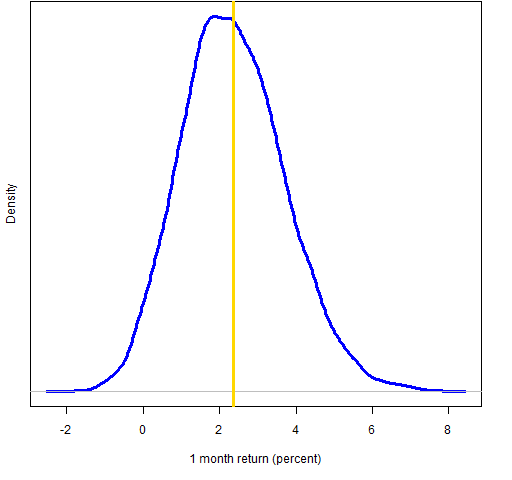
Figure 2: Bootstrap distribution of 2-month Dow golden cross (vertical line represents the data mean).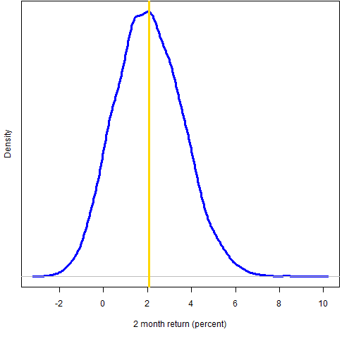
Figure 3: Bootstrap distribution of 3-month Dow golden cross (vertical line represents the data mean).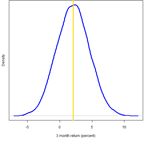
Figure 4: Bootstrap distribution of 6-month Dow golden cross (vertical line represents the data mean).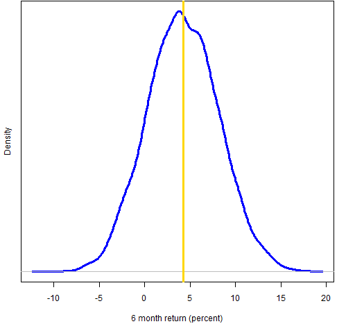
According to the bootstrap distributions there is about a 3% chance of a negative 1-month return, 8% for 2 months, 21% for 3 months and 14% for 6 months.
Appendix R
First is the code for getting the data into R. (Here are hints for beginning R.)
cg.1m <- c(2.6, 1.8, 0.9, 0.4, 6.4, -2.6, -2.9, 8.1, -.1, -.8, 12.1)
cg.2m <- c(7.5, 1.7, -1.3, -.7, 5.8, -2.4, -3.7, 7.1, -1.0, -2.6, 12.4)
cg.3m <- c(8.8, 3.3, -.1, -4.4, 12.7, -9.9, -8.4, 11.0, -1.5, -3.5, 14.8)
cg.6m <- c(-11.8, 6.1, 3.4, 4.3, 23.5, -4.2, -18.3, 14.4, 3.1, .4, 25.9)
Below is the code to do the four bootstraps:
cg.1mb <- numeric(10000)
cg.2mb <- numeric(10000)
cg.3mb <- numeric(10000)
cg.6mb <- numeric(10000)
for(i in 1:10000) cg.1mb[i] <- mean(cg.1m[sample(11,11, replace=TRUE)])
for(i in 1:10000) cg.2mb[i] <- mean(cg.2m[sample(11,11, replace=TRUE)])
for(i in 1:10000) cg.3mb[i] <- mean(cg.3m[sample(11,11, replace=TRUE)])
for(i in 1:10000) cg.6mb[i] <- mean(cg.6m[sample(11,11, replace=TRUE)])
Finally, here is the code to produce Figure 1:
plot(density(cg.1mb), lwd=3, col="blue", ylab="", main="",
xlab="1 month return (percent)", yaxt="n")
mtext("Density", side=2, line=1)
abline(v=mean(cg.1m), lwd=3, col="gold")
If you were making the plot just for yourself, you could do something like:
plot(density(cg.1mb))
abline(v=mean(cg.1m))

Hi,
Can I ask what period of data you have used to feed your bootstrap?
Is there a way to test if these conclusions are robust to different periods surveyed?
Thx.
Simon.
Simon,
I just took the data that The Reformed Broker listed, and he took the data from someone else. So that’s the way to trace the data period and such.
As the previous comment suggests, it is highly questionable that the results are especially robust. It isn’t clear to me that there are results at all. One significance test would be to select 11 random points during the period of the data and see what those results would be. You could look specifically at the mean return over the four time periods and do the random selection a number of times.
R is one of the better tools in existence for such an analysis.