Time series equivalence of brains and markets
September 27, 2011
fMRI data from 90 locations in the brain look somewhat like daily closing prices on 116 stocks if you squint just right.
Marginal Revolution was nice enough to point to “Topological isomorphisms of human brain and financial market networks”.
I’ve only just glanced through the paper. I find it interesting, but I’m fairly skeptical. The basic idea is to transform the correlation matrix into a graph (a minimal spanning tree) and then compare those graphs.
The paper says that the graphs are similar, and then points out how they are different.
There are two things that the analysis throws out which might be important in each application:
- Using correlations throws away the volatility.
- The analysis is static, how do the dynamics compare?
Skeptic that I am, I very much admire the thought process that produced the paper.
Appendix R
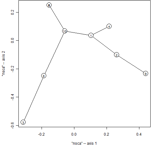
If I properly understand what the paper is doing, then you can reproduce their graph creation in R with something like:
> require(ape)
> stockspan <- mst(1 - cor(spall.ret[, 2:11]))
> plot(stockspan, graph='nsca')
The commands above:
- load the ape package into the R session
- create the correlation matrix of the returns of 10 components of the S&P 500
- transform that into the form of a distance matrix
- create the spanning tree
- plot the spanning tree in a specific format
That produces Figure 1. I don’t immediately see a way to tell the plot function to use the stock id rather than a number as the identifier. Since it is R, that could be easily rectified if the code doesn’t already allow it.
Figure 1: Minimal spanning tree of 10 stocks.