
S&P 500 sector strengths
October 10, 2012
Which sectors are coherent, and which aren’t?
Previously
The post “S&P 500 correlations up to date” looked at rolling mean correlations among stocks. In particular it looked at rolling mean correlations of stocks within sectors.
Of importance to this post is that the sectors used are taken from Wikipedia.
Relative correlations
The thought is that if the stocks within sectors really move together, then their mean correlation will be higher than the mean of the correlations across all stocks. The difference in correlations is a measure of the strength of the coherence of the sector.
The data that went into Figure 1 were created by:
- get the mean 50-day correlations of the sector with dates in 2012 (so returns in the last quarter of 2011 have some effect)
- subtract the corresponding mean 50-day correlations for the whole universe
- this makes 193 differences per sector
Figure 1 shows boxplots of the correlation differences sorted by their means.
Figure 1: Difference of sector and market mean 50-day correlations in 2012. 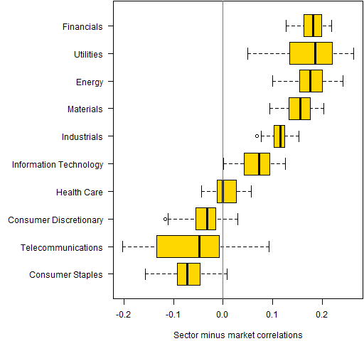 Note that the width of the boxes is variability across time — there is no indication of the variability of correlations within the sector across stocks.
Financials, Utilities and Energy are the strongest sectors.
More interesting, I think, is that Consumer Staples, Telecommunications Services and Consumer Discretionary are being anti-sectors. They have lower correlation among themselves than there is across the market as a whole.
Figure 2 shows the differences from the whole time period starting in 2006.
Figure 2: Difference of sector and market mean 50-day correlations back to 2006. 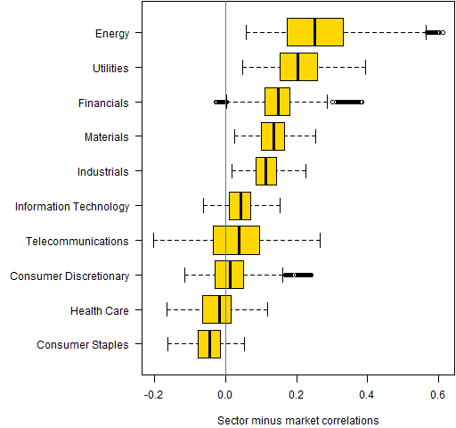
Energy and Utilities have consistently been strong sectors, and Consumer Staples has consistently been an anti-sector.
Questions
Are the “anti-sectors” merely because the categorization isn’t very good?
This seems like a complicated way of approaching the coherence of sectors. What are more direct ways of getting there?
Summary
Some sectors are more equal than others.
Appendix R
The computing and plotting were done in R.
compute differences
The function to create the differences conveniently is:
pp.corcompare <- function(sectorcors, marketcor)
{
  dnam <- names(marketcor)
  ans <- array(NA, c(length(marketcor),
     length(sectorcors)), list(dnam, names(sectorcors)))
  for(i in names(sectorcors)) {
    ans[, i] <- sectorcors[[i]]$cor[dnam] - marketcor
  }
  attr(ans, "call") <- match.call()
  ans
}
This is used (with objects created in “S&P 500 correlations up to date”) like:
marketcor <- corboot.sp50$cor
marketcor12 <- marketcor[substr(names(marketcor), 1, 4)
   == "2012"]
corcomp12 <- pp.corcompare(corboot.sectors, marketcor12)
plot
A function to create a plot is:
P.corcompare12 <-
  function (filename = "corcompare12.png")
  {
    if(length(filename)) {
      png(file=filename, width=512)
      par(mar=c(4,11, 0, 0) + .1, las=1)
    }
    cco <- corcomp12[, order(colMeans(corcomp12))]
    colnames(cco)[colnames(cco) ==
       "Telecommunications Services"] <-
       "Telecommunications"
    boxplot(cco, horizontal=TRUE, col="gold",
            xlab="Sector minus market correlations")
    abline(v=0, col="steelblue")

    if(length(filename)) {
      dev.off()
    }
  }
This is the function that created Figure 1.

What I suspect you’re really measuring is monopoly/oligopoly power within a sector. That power may be good or bad, depending on your political and/or economic stance.
Robert,
Thanks for your comment. I’m not following your line of thought, can you elaborate on why oligopoly would influence correlations?
Pat,
I’d composed a long, detailed reply, which somehow got wiped as I checked on the previous related postings. What follows is condensed and from memory.
So, in a nutshell, if markets (sectors) were the “free markets” of Adam Smith (the real one), there could be no correlations among participants. Since there are correlations, ergo there is some level of collusion.
One additional bit of analysis (if the data are easily gotten, which I doubt), would be to graph a metric of sector concentration: top 5 corporations’ market share (%-age) or x% of sector held by Y number of firms. There “should” be high correlation between a concentration measure and these correlation measures.
Robert,
Sorry to have missed the full version.
I see more clearly what you are saying now. If there were only full market impacts that are external to the market, then we would expect the correlations across the whole market and the correlations within sectors to be the same.
However, I don’t see that as realistic. If governments decided to quit maintaining roads and only supported railways, then automobile companies could be expected to all go down together. Correlation but no collusion.
Also the correlations are from market participant perceptions rather than from reality. I can imagine that there could be collusive correlation when there is no collusion, and vice versa.
Nonetheless, I think your proposed test would be interesting.
[…] This subject was discussed in “S&P 500 sector strengths”. […]