
S&P 500 correlations up to date
October 8, 2012
I haven’t heard much about correlation lately. I was curious about what it’s been doing.
Data
The dataset is daily log returns on 464 large cap US stocks from the start of 2006 to 2012 October 5.
The sector data were taken from Wikipedia.
The correlation calculated here is the mean correlation of stocks among themselves. This is lower than the value that is often calculated which is the mean correlation of the assets to the index. The difference can be seen in “On ‘Stock correlations have been rising'”. The date ascribed to a correlation is the last date in the data used.
Market correlation
Figure 1 shows the 50-day rolling mean correlation among the stocks. The vertical lines show 95% bootstrap confidence intervals where the bootstrapping is over the days. (Variability from assets is quite small.) The bootstrapping is done every 50 trading days, so each confidence interval uses different data.
Figure 1: 50-day rolling mean correlation among the stocks (blue) with 95% confidence intervals (gold). 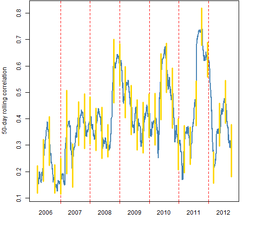
Figure 2: 200-day rolling mean correlation among the stocks (blue) with 95% confidence intervals (gold). 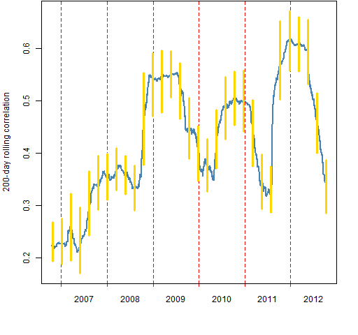
Figure 2 shows the 200-day rolling correlations. The confidence intervals are computed every 50 days, so only every 4th confidence interval uses non-overlapping data.
Figure 3 compares the lengths of the confidence intervals. If the world followed textbook assumptions, then we’d expect the 50-day intervals to be twice as long as the 200-day intervals. But the intervals will tend to be longer for periods in which correlation is changing rapidly.
Figure 3: Confidence interval lengths: 50-day (blue), 200-day (gold). 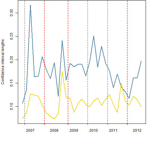
Sector correlations
The remainder of the figures show the 50-day rolling mean correlations of the stocks within sectors.
Figure 4: Consumer Discretionary 50-day rolling mean correlation.
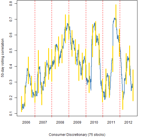
Figure 5: Consumer Staples 50-day rolling mean correlation.
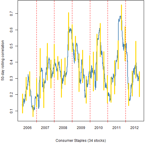
Figure 6: Energy 50-day rolling mean correlation.
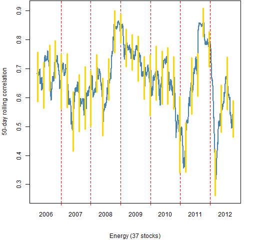
Figure 7: Financials 50-day rolling mean correlation. 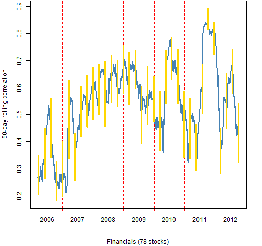
Figure 8: Health Care 50-day rolling mean correlation. 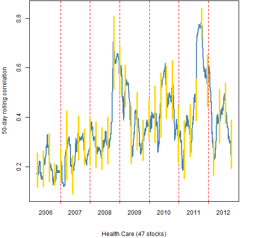
Figure 9: Industrials 50-day rolling mean correlation. 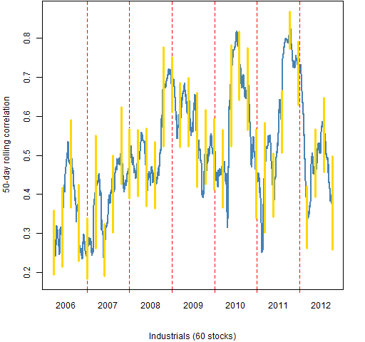
Figure 10: Information Technology 50-day rolling mean correlation. 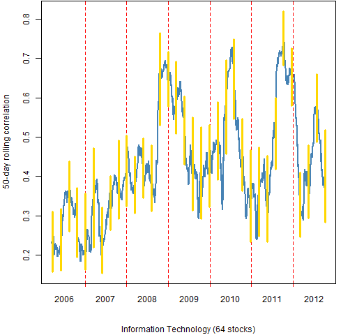
Figure 11: Materials 50-day rolling mean correlation. 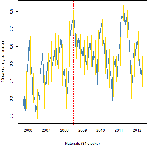
Figure 12: Telecommunications Services 50-day rolling mean correlation. 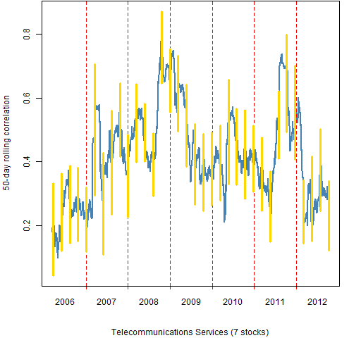
Figure 13: Utilities 50-day rolling mean correlation. 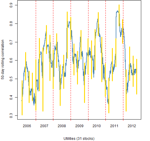
Summary
Correlations have been moderately low recently.
Appendix R
The computing and plotting were done in R.
computing correlations
The function written to create the data that went into the plots was:
pp.mean.timeboot.cor <-
  function (x, window=50, trials=200, freq=50,
     ci=c(.025, .975))
  {
    ans <- x[, 1]
    ans[] <- NA
    wseq <- (1-window):0
    bseq <- 1:trials
    nobs <- nrow(x)
    btimes <- rev(seq(to=window, from=nobs, by=-freq))
    boot <- array(NA, c(length(btimes), 2),
                  list(rownames(x)[btimes], ci))
    lt <- lower.tri(diag(ncol(x)), diag=FALSE)
    bi <- 1
    cb <- numeric(trials)
    for(i in window:nobs) {
      ans[i] <- mean(cor(x[wseq+i,])[lt])
      if(i == btimes[bi]) {
        for(j in bseq) {
          cb[j] <- mean(cor(x[sample(wseq, window,
               replace=TRUE)+i,])[lt])
        }
        boot[bi,] <- quantile(cb, probs=ci)
        bi <- bi + 1
      }
    }
    list(correlation=ans[-1:(1-window)], bootstrap=boot,
      call=match.call())
  }
To compute the correlations for 50-day windows, do:
corboot.sp50 <- pp.mean.timeboot.cor(sp5.retmat)
Doing the 1650 mean correlations and the 34 sets of bootstraps took about two and a half minutes on my (unspectacular) machine. There are slightly more than 100,000 correlations that go into the means.
plotting correlations
The plots use the pp.timeplot function which you can put into your global environment with:
source("https://www.portfolioprobe.com/R/blog/pp.timeplot.R")
This is then used like:
pp.timeplot(corboot.sp50$cor, div="years")
to get a simple plot of the rolling correlations. (See below for the actual commands to get the figures.)
confidence interval lengths
The lengths of the confidence intervals are found by:
corboot.cilen <- cbind('50'=tail(corboot.sp50$boot[,2]
   - corboot.sp50$boot[,1], 31),
   '200'=corboot.sp200$boot[,2] -
   corboot.sp200$boot[,1])
computing by sector
Here is a function that breaks up the return matrix by sector and then uses the function shown above to get the rolling correlations and confidence intervals:
pp.mbc.categ <- function(x, categ, ...) {
  stopifnot(is.factor(categ), is.matrix(x))
  categ <- categ[colnames(x)]
  levs <- levels(categ)
  ans <- vector("list", length(levs))
  names(ans) <- levs
  for(i in levs){
    this.x <- x[, categ == i]
    ans[[i]] <- pp.mean.timeboot.cor(this.x, ...)
  }
  attr(ans, 'call') <- match.call()
  ans
}
This function is then used like:
 corboot.sectors <- pp.mbc.categ(sp5.retmat,
    sp5.sector)
plotting by sector
Doing the same thing by hand for Figures 1 and 2 is not a big deal. Especially since copying the code for one and changing a few characters suffices. But now we have 10 things to do that are alike and there are some details to keep straight. This makes it well worth writing a function to do it.
Here is the plotting function for objects created by the first function listed above:
plot.corboot <- function(x, sub="", hardcopy=FALSE,
   ...)
{
  if(hardcopy) {
    filename <- paste0("cb50_", names(sub), ".png")
    png(file=filename, width=512)
    par(mar=c(5,4, 0, 2) + .1)
  }
  pp.timeplot(x$cor, ylim=range(x$boot), sub=sub,
              col=c('steelblue'), lwd=2, lty=1,
              ylab='50-day rolling correlation')
  cbtime <- match(rownames(x$boot),
                  names(x$cor))
  segments(cbtime, x$boot[,1], cbtime, x$boot[,2],
           col="gold", lwd=3)
  if(hardcopy) dev.off()
}
Note that this function is not fully abstract. It presumes that the window for computing correlations is 50 days. It also fails to include the three-dots construct into the call to pp.timeplot (as intended).
In order to use this plot function properly we need to make a suitable object for the subtitles.
sector.table <- table(sp5.sector)
sector.sub <- sector.table
sector.sub[] <- paste0(names(sector.table),
   " (", sector.table, " stocks)")
Now all the pieces are put together by:
for(i in names(sector.sub)) {
   plot.corboot(corboot.sectors[[i]], sub=sector.sub[i],
      hardcopy=TRUE)
}
This creates the files for Figures 4 through 13.

[…] post “S&P 500 correlations up to date” looked at rolling mean correlations among stocks. In particular it looked at rolling mean […]