
Replacing market indices
April 2, 2012
If equity markets suddenly sprang into existence now, would we create market indices? I’m doubtful.
Why an index?
The Dow Jones Industrial Average was born in 1896. This was when computers were humans with adding machines (but they did do parallel processing). At that point boiling “the market” down to a single number had value.
The two main uses of a market index are:
- general sense of market direction
- benchmark for a fund
Why not an index?
Now “computer” has a new meaning. We don’t have to rely on 19th century solutions.
The market is not one-dimensional — a single number is not an adequate description.
Using an index as a performance benchmark is effectively useless. It works if you have decades of information on the fund and you are willing to assume that the skill of the fund is constant throughout those decades. The alternative is random portfolios which can be used to get coherent performance measurement.
Better than an index
If you are after description, then better than a number is a picture. Perhaps like Figure 1.
Figure 1: S&P 500 constituents on 2011 December 30. 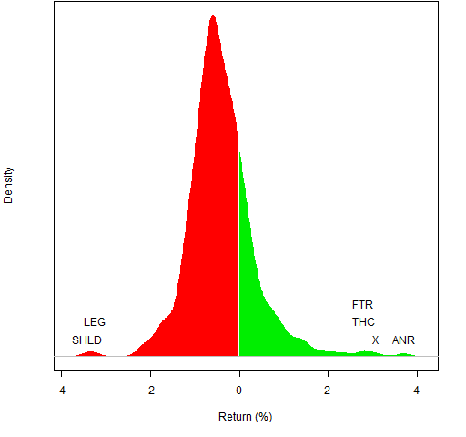 Figure 1 was the last trading day of 2011, Figure 2 is the first trading day.
Figure 2: S&P 500 constituents on 2011 January 03. 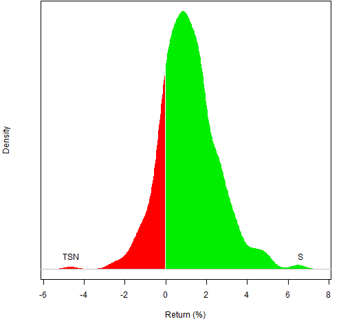
Of course, you can use any time frame that you like. Figure 3 is for all of 2011.
Figure 3: S&P 500 constituents in 2011. 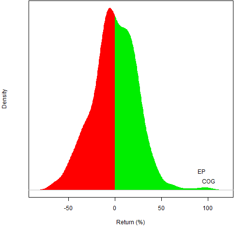 The returns in Figures 1 through 3 are simple returns. For the daily returns, the difference between simple and log returns is minimal. But it matters for the annual returns as can be seen in Figure 4.
Figure 4: S&P 500 constituents in 2011 with logarithmic returns. 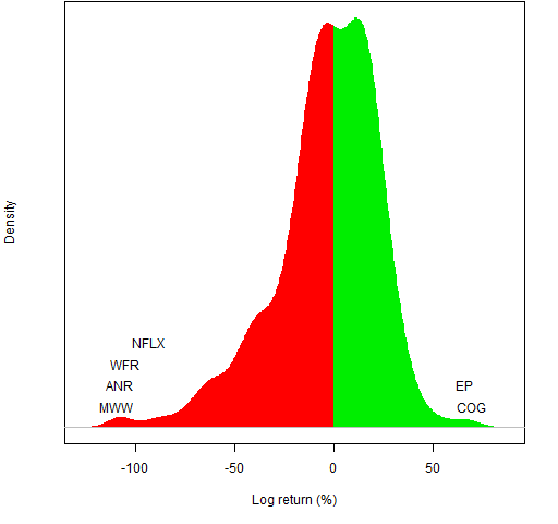
Questions
What other uses of indices are there?
How can the plot be improved?
Update (2012 May 20):
Now the quartiles are indicated in gold on the axis. The middle half of the data are inside the gold bars. The distance between the gold bars is also stated as the interquartile range.
Update (2012 April):
The idea of a commentator has been taken up, and the fractions of postive returns and of negative returns are stated.
Update: Weekly market portraits are now produced for the US.
Appendix R
The R function that drew the figures is pp.marketdistrib — its definition is in pp.marketdistrib.R
getting the function
The easiest way to get the function is to start R and then do the command:
source("https://www.portfolioprobe.com/R/blog/pp.marketdistrib.R")
identifying assets
The main argument to the function is a vector of the returns of the assets. If that vector has names, then the function allows you to identify the extreme assets with the ident argument. The flexibility of R lists allows the possibility of easily stating how to arrange the labels so they don’t overwrite each other.
The labels for Figure 2 are easy since there is no overwriting. We don’t need to use a list in this case, just a length two numeric vector saying how many we want labelled on each side — one in both cases here:
ident=c(1,1)
Figure 3 is more complex: we want no labels on the downside and two labels on the upside — but they would collide with each other if they were written on the same line:
ident=list(NULL, list(1,2))
Figure 1 is the most complex: we want to write more than one label on the same line plus others:
ident=list(list(1, 2), list(1:2, 3, 4))

[…] The initial post was “Replacing market indices” […]
[…] The initial post was “Replacing market indices” […]