
Normal market accidents
January 17, 2011
We think of accidents as abnormal events, but there is “normal accident” theory. We don’t think of accidents happening in markets, but they do. That’s why it’s called a market crash.
For normal accidents to come into play, two conditions need to hold:
- the system is complex
- the system is tightly coupled
Certainly the financial system qualifies.
When the two attributes hold, there are countless paths that the system can take and there will be no way for anyone to predict with any accuracy where the system goes. There will be numerous “trajectory of accident” opportunities.
Often attempts to improve the safety of the system actually make it less safe. Some examples of this are given in the wonderful piece by Tim Harford called What can we learn from a nuclear reactor?
Where to go?
Safer means reducing complexity or coupling.
I don’t see that there is much to be done about complexity. The financial system is inherently complex. We can eliminate some complex instruments. Such moves might be a good idea, but that isn’t really going to affect the complexity of the system much.
Reducing coupling is possible. That means eliminating too-big-to-fail. This is equivalent to installing safety gates in domino displays so that accidents cause only limited damage.
 A toy for contagion
I’ve written a function in R that implements a devastatingly simple model of contagion. Failures can happen spontaneously with some (fixed) probability. Failures can also be passed vertically or horizontally to neighbors. Each entity has its own susceptibility to vertical contagion and a separate susceptibility to horizontal contagion.
The plot method shows when failures occur. The plots here are shown with topographic colors — blue is early, then green, yellow and tan. White means no failure.
> plot(contagion(60, 60)) # Figure 1
Figure 1: An instance with equal contagion vertically and horizontally.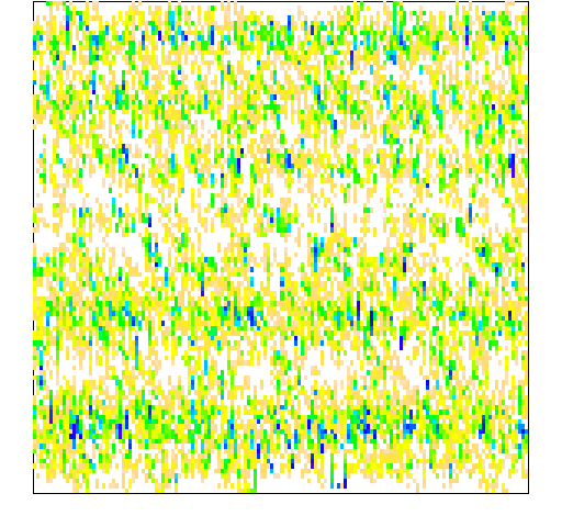
> plot(contagion(20, 100)) # Figure 2
Figure 2: Instance with more horizontal contagion than vertical contagion.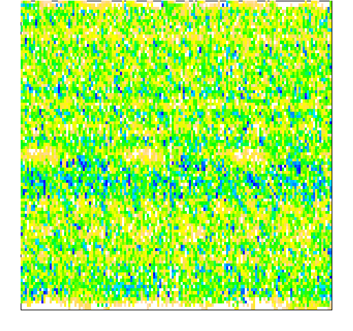
> plot(contagion(100, 20)) # Figure 3
Figure 3: Instance with more vertical contagion than horizontal contagion.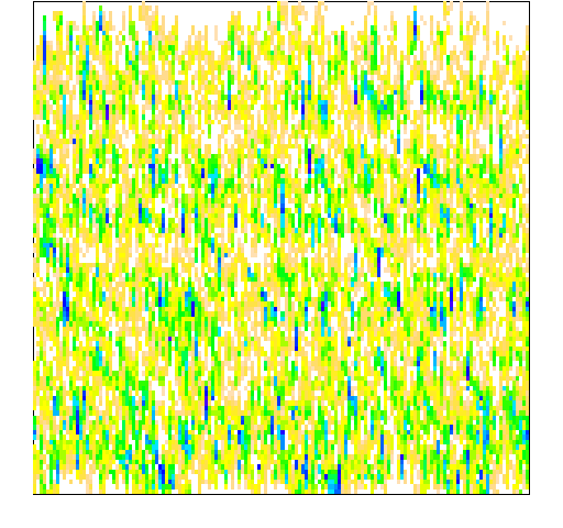 A reason that Figure 3 doesn’t look like Figure 2 on its side is that there are 150 entities across and 100 vertically. Another reason would be if there are still bugs in the function — no guarantees there (in other words, reasonably likely).
The most obvious thing from the plots is that it pays to be on the edge where there is less chance of catching failure from others.
There are lots of directions to take this:
- more thoughtful contagion distributions
- time varying spontaneous failure
- animation of the failures instead of a static plot
- …
You can get the contagion function and the plot method for the objects it creates with the R command:
> source('https://www.portfolioprobe.com/R/blog/contagion_funs.R')
Please have a play with them and let me know of nice improvements. Extra points for most artistic.
Epilogue
He was an accident waiting to happen
Most accidents happen at home
Maybe he should’ve gone out more often
Porcelain Monkey by Warren Zevon and Jorge Calderon
Photo from istockphoto.com

[…] This post was mentioned on Twitter by John Fawcett. John Fawcett said: RT @portfolioprobe: Normal market accidents http://bit.ly/i1vKTQ from the glitter to the gloom #risk #rstats […]