
Market arrows
June 16, 2011
Graphs like Figure 1 are reasonably common. But they are not reasonable.
Figure 1: A (log) price series with an explicit guide line. 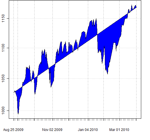 Some have the prices on a logarithmic scale, which is an improvement on the raw prices.
The problem with this sort of plot is that two particular data points are taken as special. These two points are essentially assumed to have no error. The plot then invites the observer to project — under false pretenses — into the future.
There is also a substantial amount of self-censoring with these plots. I suspect you are very unlikely to see any plots that look like Figure 2.
Figure 2: Another log price series with explicit guide line. 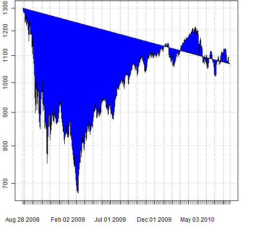
Questions
Is there a name for this type of plot?
Appendix R
Though the plots are not useful, the technique to make them in R can be useful. The basic trick is to add a polygon to the existing plot.
The function that created the figures is pp.timelinefill. You can get it into your R session with the command:
source("https://www.portfolioprobe.com/R/blog/pp.timelinefill.R")
Epilogue
I can saw a woman in two
But you won’t want to look in the box when I do
from “For my next trick I’ll need a volunteer” by Warren Zevon
