
Another look at autocorrelation in the S&P 500
November 11, 2011
Casting doubt on the possibility of mean reversion in the S&P 500 lately.
Previously
A look at volatility estimates in “The mystery of volatility estimates from daily versus monthly returns” led to considering the possibility of autocorrelation in the returns. I estimated an AR(1) model through time and added a naive confidence interval to the plot.
With that confidence interval there is a suggestion that there may be mean reversion lately. Gappy, in a comment to that post, is not so sure. He contributed an analysis using a more rigorous method of getting the interval, and used the Bonferroni method to account for multiple comparison.
The plot
Figure 1 shows a slightly prettified version of Gappy’s plot.
Figure 1: Autoregression coefficient of S&P 500 returns with 95% Bonferroni confidence interval. 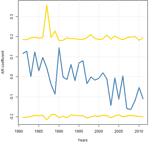 The “years” are not actual calendar years — they end in early November.
Comments
Bonferroni limits are conservative (that is, wide). I have no idea how conservative in this case.
I think one of the key things to take away from this plot is the consistency of the interval over time. Changes in volatility don’t seem to affect it.
Given that consistency, my naive confidence interval doesn’t seem so bad after all. The number of years in this plot less than my lower limit looks to be at least 3 (out of 31), or almost 10%. Since that is more than 5%, that would argue towards mean reversion.
But if we don’t want to believe that there was positive autocorrelation in this period, then noting that the tails of the current estimates are reasonably symmetric around zero would argue against mean reversion.
Another point in favor of mean reversion is the downward trend of the AR coefficient. However, we can easily be fooled into thinking there is a trend when there is not one.
Appendix R
The analysis was done with:
source('spxanalysis.R')
Actually that was step 3. Step 1 was saving the file to my computer (optional). Step 2 was starting R.
This highlights some of the power of R. In less than 40 lines Gappy created quite a sophisticated analysis and then could transmit that so that anyone* can reproduce it with one trivial command.
* “anyone” is hyperbole — you need a computer with internet access.

[…] mystery of volatility estimates from daily versus monthly returns” and its offspring “Another look at autocorrelation in the S&P 500″ discussed what appears to be an anomaly in the estimation of volatility from daily versus monthly […]