
A minimum variance portfolio in 2011
February 29, 2012
2011 was a good vintage for minimum variance, at least among stocks in the S&P 500.
Previously
The post “Realized efficient frontiers” included, of course, a minimum variance portfolio. That portfolio seemed interesting enough to explore some more.
“What does ‘passive investing’ really mean” suggests that minimum variance should be considered a form of passive investing.
Valuation
Figure 1: The value of the minimum variance portfolio throughout 2011. 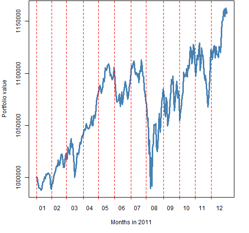 The portfolio was constructed to be worth $1 million at the start of the year. It went slightly underwater with the early August crash, but then gained over 15% by the end of the year.
Stock picking
Figure 2: QQ-plot of returns during 2011 for stocks in the portfolio (blue) and out of it (gold). 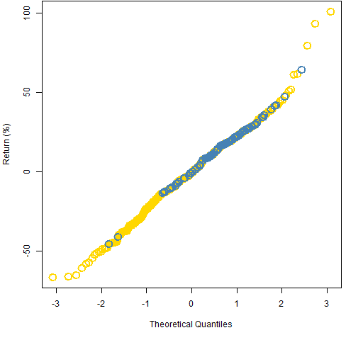
It’s not as if the optimizer was looking for stocks that would have good returns, but — as Figure 2 shows — it did quite a good job of selecting 90 stocks.
Figure 3 shows the stock returns during 2011 versus the predicted volatilities.
Figure 3: 2011 returns of stocks versus predicted volatility, plus the default lowess smooth. 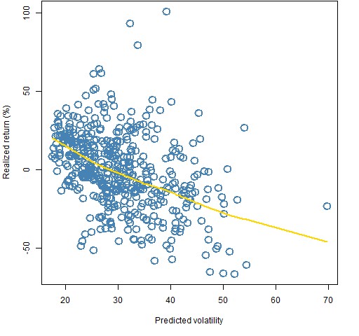
Elsewhere
Another view of minimum variance in 2011 is from Javier Nogales.
Epilogue
the price you pay for the chains you refuse
from “Beeswing” by Richard Thompson
Appendix R
time plot
Figure 1 was created with a newly enhanced version of pp.timeplot which is available at https://www.portfolioprobe.com/R/blog/pp.timeplot.R
You can get the function into your R session with:
source("https://www.portfolioprobe.com/R/blog/pp.timeplot.R")
multi-colored QQ-plot
The code that produced Figure 2 is:
qqob <- qqnorm(sp5.ret11 * 100, type="n", main="", ylab="Return (%)")
inp <- names(qqob$y) %in% names(op2.mv.sp5$new.portfolio)
points(qqob$x[!inp], qqob$y[!inp], col="gold", cex=2, lwd=2)
points(qqob$x[inp], qqob$y[inp], col="steelblue", cex=2, lwd=2)
The first step is to create the plot layout but avoid doing the actual plotting. Another part of that step is to save the output of qqnorm (which is returned invisibly and usually not of interest).
Then a logical vector is created that says which points are in the portfolio. Finally the data points are added to the plot. We are interested in the blue ones so they are done last.

[…] the post “A minimum variance portfolio in 2011″ we explored a particular portfolio. Figure 1 shows its value through 2011. We’ll use this […]