
Tis the season to predict
January 3, 2011
I predict there will be a lot of predictions of markets for the coming year. Here is a calibration of such predictions.
We show the prediction distribution of levels of several equity indices (plus oil price) at the end of 2011 assuming nothing happens. That is, we’ve taken out market trends and just left drift (more details below, and in tomorrow’s blog post).
[Revision: there was a problem with the computation of the plots below. You should ignore them in favor of the plots in Revised market prediction distributions.]North America
Figure 1: Dow Jones Industrial Average (USA) 2011 prediction distribution.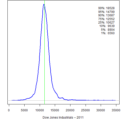
Figure 2: S&P 500 (USA) 2011 prediction distribution.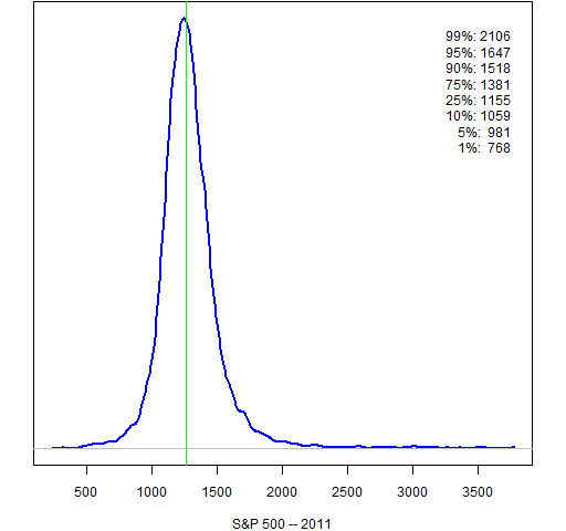
Figure 3: Nasdaq Composite (USA) 2011 prediction distribution.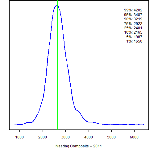
Figure 4: S&P/TSX Composite (Canada) 2011 prediction distribution.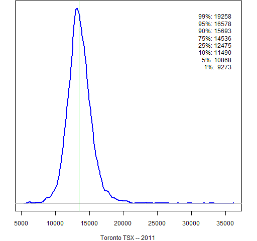
Figure 5: IPC (Mexico) 2011 prediction distribution.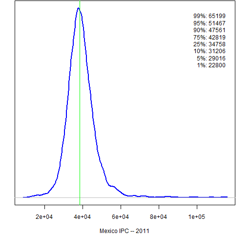
South America
Figure 6: Bovespa (Brazil) 2011 prediction distribution.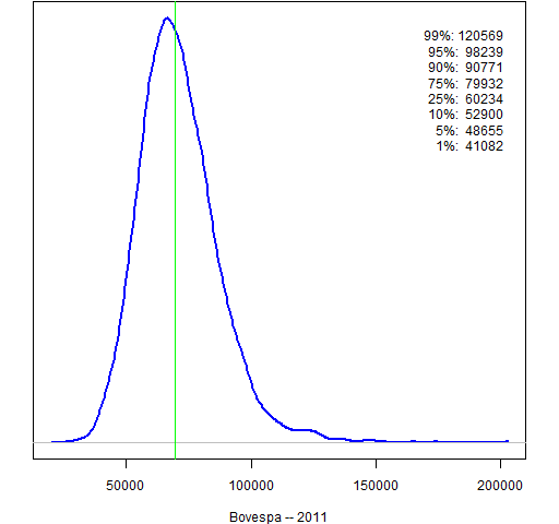
Figure 7: MERVAL (Argentina) 2011 prediction distribution.
Europe
Figure 8: FTSE 100 (UK) 2011 prediction distribution.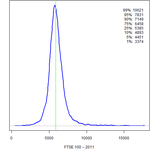
Figure 9: CAC 40 (France) 2011 prediction distribution.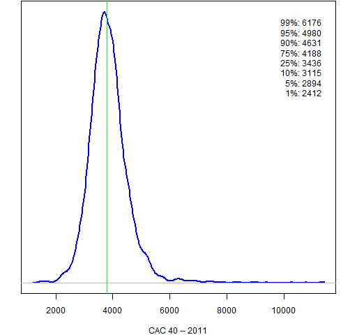
Figure 10: DAX (Germany) 2011 prediction distribution.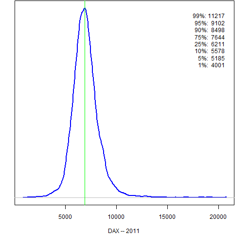
Figure 11: AEX (Netherlands) 2011 prediction distribution.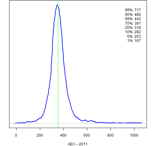
Figure 12: IBEX 35 (Spain) 2011 prediction distribution.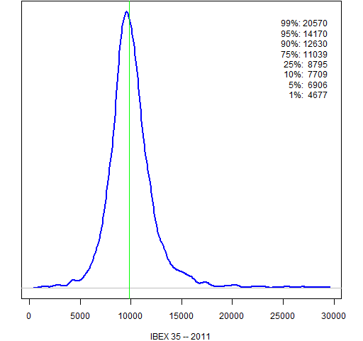
Figure 13: Euro Stoxx 50 (Europe) 2011 prediction distribution.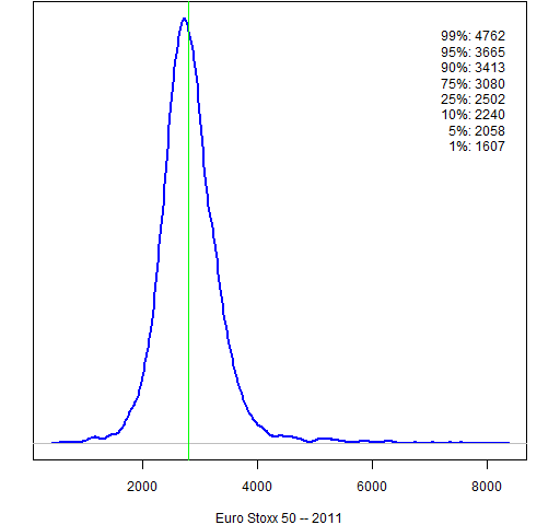
The East
Figure 14: Nikkei 225 (Japan) 2011 prediction distribution.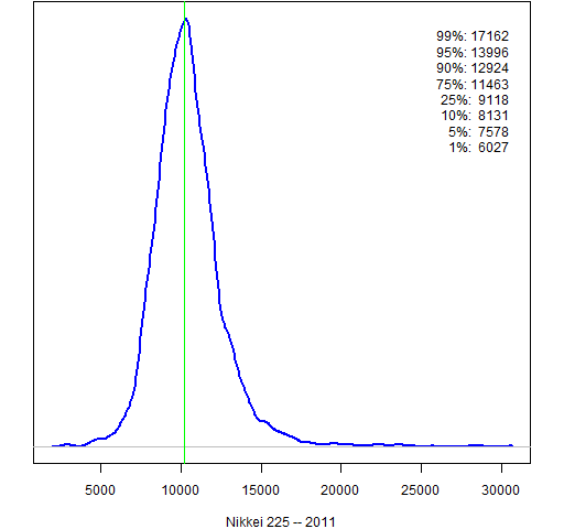
Figure 15: Hang Seng (Hong Kong) 2011 prediction distribution.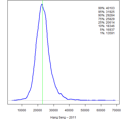
Figure 16: Shanghai Composite (China) 2011 prediction distribution.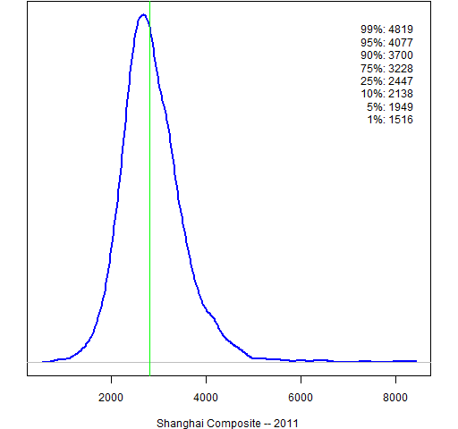
Figure 17: Straits Times (Singapore) 2011 prediction distribution.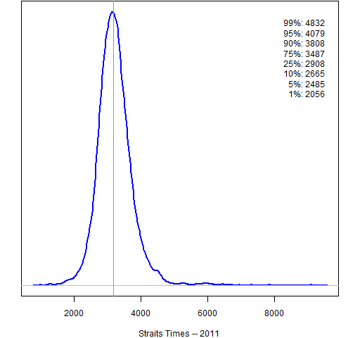
Figure 18: All Ordinaries (Australia) 2011 prediction distribution.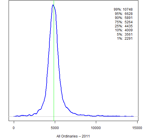
Figure 19: Sensex (India) 2011 prediction distribution.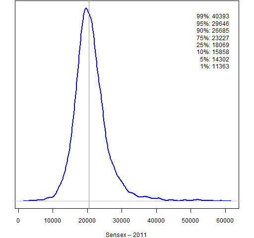
Oil price
Figure 20: Cushing OK contract 1 (US dollar) 2011 prediction distribution.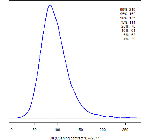
Implications
The distributions are very wide. If these distributions are even loosely correct, then we have very little basis to distinguish real market moves from random drift.
Method
There will be more details in tomorrow’s blog post, but here is the outline of what was done:
- start with 8 years of returns
- take out an (excessively volatile) expected return at each point in time
- fit a GARCH(1,1) model
- simulate 250 trading days ahead starting with the current state
Epilogue
Figures may be reproduced with attribution.
Stock index data are from Yahoo. Oil price data are from the U. S. Energy Information Administration.
Flowingdata points to this musical recap of 2010: The Dow Piano.
