Get data that fit before you fit data.
Why verify?
Garbage in, garbage out.
How to verify
The example data used here is daily (adjusted) prices of stocks. By some magic that I’m yet to fathom, market data can be wondrously wrong even without the benefit of the possibility of transcription errors. It doesn’t seem so mysterious that this happens with free data, but it features in data with hefty price tags as well.
You can create rule-based tools that catch common errors for a specific type of data. For price series one test is to flag daily returns that are larger than 40 or 50 percent in absolute value. Many points that are flagged this way will actually be correct, but it will catch many of the errors.
However, the best data verification tool is your occipital lobe. Plotting data can be extremely effective at highlighting problems.
An R example
Our aim is to get plots similar to Figure 1.
Figure 1: Example plot of daily prices of a stock. 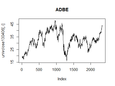 Given a matrix of prices (where assets are in columns), the canonical R command to get a set of plots is:
for(i in 1:ncol(pricemat))
   plot(pricemat[,i], type='l',
      main=colnames(pricemat)[i])
For R novices: This loops through the columns of the matrix and plots a column at a time. The type is lower-case L as in “line” (meaning draw a line between one point and the next) and the main title is the column name. Since only one data object is given to plot, it sets the horizontal axis to the sequence of where the points are in the vector of data.
If you are using RStudio, then this will be all you need to do if there are only a few assets in your matrix. RStudio collects a stack of plots that you can move between. If you have too many assets, then you lose all but the last several plots. I believe that currently the number of plots is hardcoded to be 30.
If you are not using RStudio or you have more than 30 assets, then an alternative is to do the for loop above after you have issued the command:
par(ask=TRUE)
When the ask graphics parameter is TRUE, then you are prompted to hit the return key before R will draw the new plot. A disadvantage is that you don’t get to go back and look at previous plots — you need to write down which ones you want to review.
You can attempt to have the best of both worlds by modifying the loop slightly:
for(i in 1:ncol(pricemat)) {
   if(i %% 29) par(ask=FALSE) else par(ask=TRUE)
   plot(pricemat[,i], type='l',
      main=colnames(pricemat)[i])
}
R explanation: if the looping variable i is divisible by 29, then ask is set to TRUE otherwise it is set to FALSE. The %% operator performs the mod operation — the remainder of the first after dividing by the second. The if condition is coerced to be logical with zero mapping to FALSE and all other values mapping to TRUE.
Under RStudio with this modified loop you get a set of plots to look through, then you hit the return key to get the next batch.
R technical note: the ask parameter only works with base graphics, not with ggplot or grid.
Unfortunately the plotting process doesn’t scale well. Occasionally looking at a few hundred plots is quite feasible. Your enthusiasm is likely to flag once a thousand go by, especially if this is a regular occurrence.
A possible course of action if you have a river of data: Plot a random selection until you get a sense of what errors are most important to protect against. Then write rules-based tests to catch those. Also automatically generate a few randomly selected plots as an additional test.
Price series
What’s wrong with the data in the following plots?
Figure 2: Weird data. 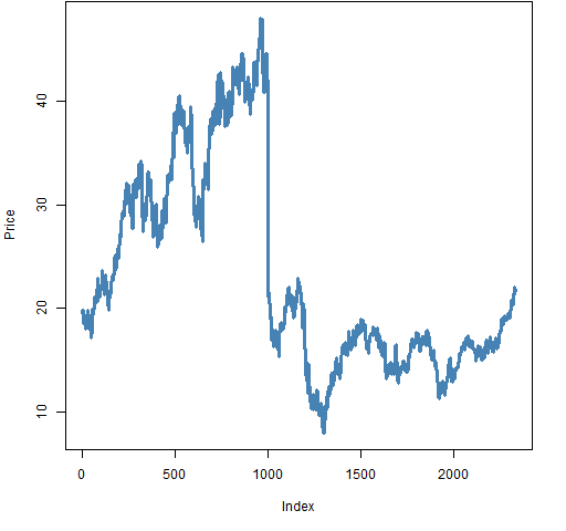
Figure 2 shows an example of a series with a missed stock split. It is possible for a stock to lose half its value in a single day, but this plot doesn’t have the feel of a stock where that actually happened.
Figure 3: More weird data. 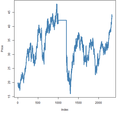
Figure 3 shows a series where the price gets stuck at one value for a while. This is an easy thing to test with a rule, but it isn’t something you are likely to think to test until you have seen it happen in data.
Figure 4: Yet more weird data. 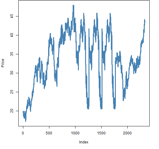
Figure 4 has stretches of data repeated. Something like this is dreadfully hard to guard against. It’s not likely to strike the same way twice.
When to verify
Early and often.
Once upon a time I was trying to predict returns and — in time-saving mode — didn’t plot the data. I struggled over things not working out well. Finally I came to appreciate that my supposedly efficient method was actually an anti-lazy approach. Quicker would have been if I had plotted the data first instead of waiting until I was totally frustrated. The plot looked rather like Figure 4.
Epilogue
Every vow you break
Every smile you fake
Every claim you stake
I’ll be watching you
from “Every Breath You Take” by Sting.
Appendix R
There are multiple ways to get price data into R. One of them is to use the pp.TTR.multsymbol function that is in the pprobeSup package. You can get the package with the command:
install.packages("pprobeSup",
   repos="https://www.portfolioprobe.com/R")
After you install the package once, you need to load it into each R session in which you want to use it:
require(pprobeSup)
The initial 2013 market portrait post shows commands to scrape S&P 500 tickers from Wikipedia.
Hi,
Nice post. Never encountered stretches of data repeated yet, at least now I am aware they are a possibility…thanks!
In my routine checks I also try to verify at High and Lows, especially:
– whether Highs and Lows are actually higher and lower then Opening and Closing values;
– where the Highs and Lows are compared with the Opening and Closing values (trickier to automate than with closing prices, as intraday squeezes/plunges are certainly a possibility).
And finally, when dealing with futures and roll-overs I discovered that checks on (expiry) dates are really necessary.
Andrea
Andrea,
Thanks for your comments. Speaking of intraday data, it is nice if the bid is less than the ask.
Pingback: Tuesday links: unfair markets | Abnormal Returns
I’ve seen some weird things with the GSCI commodity data in Factset. It’ll have like a big spike one day that disappears the next (could be related to the roll or something).
Unrelated I’m sure, but this reminds me that a typo in a price shows up as a spike in one direction and an almost equal spike in the other direction at the next time point.
Pingback: Sector Composites II | Prudent Trader
Pingback: Blog year 2013 in review | Portfolio Probe | Generate random portfolios. Fund management software by Burns Statistics
Pingback: BurStFin R package version 1.02 released | Portfolio Probe | Generate random portfolios. Fund management software by Burns Statistics
Pingback: BurStFin R package version 1.02 released ← Patient 2 Earn